BCM 300: Cosmic Mercenaries: Event Horizon
This article title officially has too many colons. And the English language is disgusting for not spelling colon and colon differently.

So before reading this post, I would recommend reading this one here first, as I am discussing my progress with that project. So I have been making steady progress on developing this board game experience and am really happy with how the project has been shaping up. Still as yet have been unable to get proper playtesting done with players, but have managed to get several people to read through the rules and give their understanding, and have done some theoretical playtesting myself.
First Feedback
My first bit of feedback from people came in the form of misunderstandings, something to be expected when putting thoughts to paper, and found explanations to be not detailed enough to have a firm understanding what the game entailed. So my first reiteration of the game involved adding more details to the setup and the terms being used, and including a diagram on how to read the cards.
Probably the biggest key example is this, lifted straight from a feedback document.
“Give each player 8 dice to represent their characters hp and ap. The player’s commander with the highest speed stat chooses the first map, then alternate each round choosing the next board.” This part felt a bit unclear – what are you meant to do here? (Roll dice?)
Second Feedback
The second bit of feedback I received had some points to do with the theme of the game being unclear, and that a lot of the rules which were quite long would be hard to remember; and knowing how to win the game would be difficult to track down in the rules book as it was presented.
The set-up and rules are a little heavy to follow although the same can be said of most games. If you’re not planning on creating a play through video could you include pictures or a diagram of the set-up? At least to show where everything is meant to go.
On this note of set-up I think you need to start the instructions with a clearly defined “set-up” heading before going into the game phrases. It’s a little odd that you talk about drafting before deployment (which I think is set-up).
I like the Reading the Cards section. It’s helpful.
I think you need a clearly labelled “How to Win” section. As there are so many rules players will often initially flip through the guide book to refresh their memory. Having it clearly labelled helps players to find what they need immediately and helps keep the game moving.
And so again restructuring the rules to be more clear and adding more information where necessary seemed to be the way to go, the experience of this game was not to be weighed down by lots and lots of minutiae and number tracking and dice rolling and math, but to be quite easy to pickup and play.
To help this I added a player screen, serving a dual purpose; hides your actions and cards from the enemy, and gives an easy space to provide prompts and a cheat sheet for the rules and systems in the game.

So how has it come together?
The game really revolves around this feeling of being a ragtag group of mercenaries, and captures a duality of feeling between “getting paid” and “not worth my life” kind of feelings that really evoke that sense of character from worlds such as Borderlands, which while it wasn’t a direct influence that I drew inspiration from, now looking at the larger picture I can see that clearly.
So the game has a few major stages of the game, first is the drafting stage, which is a bit different to the drafting mechanic in similar drafting card games. In this game you draft from 3 cards that you draw, only choosing one and creating a unique mercenary with a unique skillset, which can further be customised with up to two unique equipment cards. With a total of 136 cards to choose from, 24 unique characters, 32 unique abilities and over 40 (I lost count okay) Unique items, there is a huge number of unique combinations, that can really make your team feel like your own.
The second stage of the game, has players trying to navigate a chaotic evershifting board, with escalating feelings of chaos as the ship bends and breaks around them in the mad dash to grab the objective and run. The game is a basic move game, no dice rolling and calculating anything more than X – Y, and much of the complicated interactions and rules relegated to being on the cards instead of a complicated manual.
And finally is the debriefing, count up credits, buy more equipment, and get ready to make another run! OR retire and count up your retirement fund.
Final Thoughts
Now to say there hasn’t been much progress on the game systems themselves isn’t much of a lie to be honest, but I feel this is mostly due to the fact I very early in the process chopped and changed and switched between multiple states of the game. Early on it began as a single player only game on a static board, and then a second game with the board shifting mechanic before the two kinda drifted toward each other, but the way an audience interacts with these systems and how they are presented to the player has changed.
The game I feel has huge potential for emergent narrative, creating characters with personality and allowing players to get attached to certain characters and their builds.
But don’t take my word for it, because I feel the game is in an awesome state and deserves some much needed playtesting. I have a kind of print and play available to download for free HERE, you will need a friend and some dice, or at least dice rolling apps. And lets be honest, some patience for arts and craft, but I really am excited to have this project go as far as we can take it!
07/06/2020: The game has had some minor updates to the overall structure, and I felt compelled to record those changes somewhere, the game turns are now limited to 5 actions per side per turn, meaning players now have to carefully think what actions to do, and prevents players from stacking up on ap and doing lots of little actions to bugger the action economy to put in technical terms.
The other change was to the chaos phase, which I feel is critical to the feeling of the game, instead of relying on two dice rolls for each effect which majorly slowed down this phase of the game, the players now have a focal marker, which by using a d8 corresponding to the 8 directions, can move three times at the beginning of the chaos phase before rolling the d6, and then all anomalies are centred on this marker. This meant the game wasn’t stopped to a crawl at the chaos phase, and allowed players to have some level of prediction on what could happen each phase.
BCM 300: Group Contribution Summary
So our group of 4 have really struggled to fully develop a game together, mostly due to the difficult nature of organising in this online environment, but we were able to get some early direction together, and have managed to get the beginnings of a truly cohesive experience for players.
Inspo Time!
We borrowed heavily from a few major sources and used these as examples of the viability of a game such as this in the market!
Arkham Horror
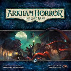
Designed by Nate French, Matthew Newman
Published by Fantasy Flight Games in 2016
The game features an exciting investigative aspect and utilises cards that convey the character of each player really well
Kingdom Death: Monster

Designed by Adam Poots
Published by Kingdom Death (self published) in 2015
This game utilises the key horrifying creature fighting and persistent world that will be key in our board game.
Slay The Spire

Designed and Published by Mega Crit Games in 2019
A digital card game, and so while a lot of aspects can be unwieldy to implement in a tabletop setting, a lot of the key features of our game can be traced back to this game.
Munchkin

Designed by Steve Jackson
Published by Steve Jackson Games in 2001
This game was a key inspiration for the AI deck that you fight against.
Horrors From Beyond
Designed by Us in now time.
The game is a horror card game based around climactic and difficult puzzle like battles against an AI deck. In the game players choose a character, consisting of a passive trait and 10 cards, and then adding a number of cards from a equipment deck store. Players then work together (or alone) to defeat a monster represented by a deck of cards that automatically play when drawn.
The key aspects that I was involved with was the initial various idea proposals, upon which we discussed between them which we preferred, which ended up being the Horror Card Game. After this was decided the basic idea for the rules was cemented down into game systems, which I wrote down and was then proofread and clarified with the other group members.
The theme was the next discussion, after making some suggestions that would allow us to explore the characters, and monsters, in a setting and narrative. I made some suggestions and gave a rundown on the various benefits and negatives of each thematic setting, until after some discussion with Olivia we arrived at the modern/scifi setting.
And so after that I created some basic ideas for flaws to integrate into cards for characters, and Olivia created some rough archetypes for the characters in terms of name, bio, and flaws. I then created the six monsters and the decks they would use, and the six characters and the cards they would start with, while Olivia began on the equipment cards.
The game still has some work to go before it is finished into a cohesive piece, and then we just need to prepare a presentation.
VCD 302: Project Proposal
The project is an ambitious title sequence, combining cel animation, 2.5D animation, and integration of word type. The project is themed around a theoretical title sequence for a short animation film, and is to act as the primary tone setter for the audience and prepare the viewer for the experience.
The overall tone the sequence is trying to portray is a duality of bright and colourful, almost to the extent of a fever dream, which is to be contrasted with the minimalist and muted undergrowth in the latter half. This is to rely a lot more heavily on narrative elements of the motion design, and is going to be borrowing heavily from cinematic techniques, such as panning shots and cuts.
What design elements are going to be expressed?
The motion design elements that will be present is long list but the key elements will be the use of 2D elements moving in 3D space; this is to create a sense of the space the characters inhabit and the way these character act in this environment.
Rhythm is also critically important, following a narrative pacing allows the audience to more easily immerse themselves in the world created.
And finally will be the creation of kinetic type, creating a strong sense of the experience that is coming, but integrating this type into the world and tying it directly to the sequence.


Technical Process
The process has a very clear production timeline; the backgrounds and the environment the characters inhabit is created in Photoshop, using a digital painting technique. This is chosen because it has an extremely fast production, that has a nice natural feel, and is very reminiscent of older Cel Animation such as Land Before Time.

The environments will then have smaller secondary motion created in After Effects, such as camera movement and elements in the environment moving such as wind, and water. The first set of environments created in after effects have created a distinct style, with a lot of colour, but will be reanalysed once the key motion and events have been created in the final stage of production.
The key stage is the Cel Animation Style, this will be done in program called Toon Boom Harmony. This program was chosen for it’s greater range of features allowing for faster production, and it’s ability to mix vector based graphics, for clean lines and motion that is easily scalable, and raster based graphics, in order to add better lighting and effects to the characters in the 3D space.
And finally will be the final stage in After Effects again, this will involve unifying the various elements into a more uniform colour grade and visual style, further tuning secondary motion, and of course implementing kinetic type to create the title sequence.
Of course this is an ambitious project, despite only being a sequence less than 30 seconds in length, it has a lot of interconnected elements in lots of different programs; and so the key skill to be implemented is ensuring quick workflow on each stage.
BCM 303: Collaborative DA, Reflection
So in this subject I was placed in a group of 5 people under the name “Stoopid” (hilarious I know), of which we had what would normally be a blessing, at least in my opinion, if the collaboration was in a shared physical space, where communication and sharing of assets and individuals was less obstructed by digital constraints, but had the unfortunate aspect of being of mostly similar backgrounds in a visual orientated profession.
I found the collaboration process good and fortunate because our particular group agreed a lot on the direction we should go, and the similarity of our expertise made finding a direction to take the project quite easy; but frequently through the process, I was almost worried to create something and do a part of the project in case of stepping on the proverbial toes of our other team members. I am uncertain if this was a sentiment shared by my other team members, but I definitely feel the effects of the digital space made knowing where each person was at and what was needed to go forward extremely unclear and coordination of assets of the larger project harder and more difficult.
Because of this barrier, I feel our final DA is a little disjointed from it’s two halves (figuratively, their not exactly half) but I do feel considering our limitations and the scope of what we made that we have achieved something really effective, if at times a little unclear. The piece acts as a narrative like short film, but told through a first person interaction with an alternate future, heavily inspired by Orwellian Themes. The first part acts as a archived PSA that has been hijacked by an unnamed rebellion, and the second half acts as a fear mongering piece of propaganda from this unnamed rebellion, showing the dangers of the world and the people they are becoming.
The group specifically had two editors, myself and Timothy; I primarily worked on the last part after the PSA, and adding the extra ‘glitch’ effects during the PSA section. Timothy Edited the PSA including the base framework for the glitch aspects, and aligned the separate vocals with the visuals.
Jaime and Briannon, created the first draft of the script in the PSA section, and Isobel Filmed and Acted the majority of the PSA segment. Briannon worked as the Vocal Talent and Audio mixer for the glitched sections.
In conclusion I feel the work we have created was quite excellent, and had a strong sense of personality and a unique perspective and mode of delivery. I feel the work has a strong potential to be expanded with a transmedia aspects, and to be honest, I am a little sad to see the DA to be transferred to someone else, but am excited to see how the next project will go.
VCD 302: Design Analysis and Reflection

So overall I’m relatively happy with how the project went, while it isn’t polished, what I like is it’s narrative-esque in it’s pacing, as the beginning of the video, all the way to the end, goes from my first foray of motion design or After Effects work all the way until the end where I feel I had gotten better and confident (because that’s something I need) about my ability.
On a technical achievement, I feel the beginning is the weakest, it started from a poster, as the original task we had been set out was to ArtiVive a poster and have a video play over that, and so I started with a basic poster I threw together as a starting point (and lets be honest, not exactly my best work for a poster) and then explored from there. But I really do feel that the piece gets stronger, more complex and interesting as the piece ‘moves’ along, and while far from the sheer number of fonts and complexity of the title sequence I’ve been referencing and loving since day one in this subject, it did accurately capture the emotion I was aiming for, and on a technical level, I explored a wide range of techniques to use in design.
In terms of motion design fundamentals, I feel my choice in subject matter, a title sequence attempting to capture a staccato fast paced jolt of motion and type, left a lot of the key fundamentals that were cited by Disney and Lupton/Phillips in the previous blog posts, not fitting the aesthetic and style I was attempting to convey, but I tried to maintain a strong sense of perspective and changing size and shape to convey motion of the perspective, and used the very small comet at the beginning to explore some aspects of squashing, shape change, and acceleration and deceleration.
I think the design and aesthetic, is stark and punchy, which was a goal I was aiming for, but by virtue of trying to employ so many different forms and type, the style from the start to the end is a little too disjointed. I feel if this sequence was extended out to a minute, the change could be more gradual, and this wouldn’t feel so heavily contrasted.
So I think overall this presented a huge learning opportunity, and I felt like my evolution from never using After Effects before, to not only developing a firm understanding of the technicalities of the program, but critically developing a personal style within the framework of After Effects. In particular the ‘dripping’ segment helped with understanding the camera in 3D space, and the final flashes at the end let me explore transitioning and how I can tie seemingly disjointed motion together. For the future, I feel I want to explore an animation exploring the 12 Disney principles in it’s entirety, and developing a sense of character animation, including the lessons and aesthetics explored here. Nine words left, how do I finish this post?
VCD 302: Design Process
So my design process begins very messy at first; it is just the way I work. I strongly stick to the ‘Double-Diamond-Design-Discipline’ (alliteration is beautiful).

As well structured as it looks up there, it mostly involves just throwing every idea technique (or in this case, having never used After Effects before, lack thereof) at the wall and seeing what sticks. I tend to learn better myself making lots of mistakes and more than likely, making something that looks like dookie (a PG rated word for excrement) and picking the bits that work out from that, rather than following a structured tutorial.
In the book “Graphic Design: The New Basics” by Lupton and Phillips in 2008, line and shape in still images still convey motion, and so adopting these principles in design, particularly for motion design where the shapes and lines accentuate the motion on screen. In particular referencing how changes on a 2d plane can mimic the changes on a 3d plane.
Another one of the key principles of animation is ‘Disney’s 12’; most of which isn’t relevant to the type of motion design I am doing for this first assignment, but I am planning to explore more character focused animation in the following assignment! The most important aspect’s I will be taking from Disney’s 12 Principles, is pose to pose animation (mostly for efficiency of what I am exploring), Squashing, and Slow in and Slow out.
Rhythmus 21 by Hans Richter (screen shot below) and The Innovation of Loneliness (screen shot below that) are two strong examples of animation that doesn’t attempt to mimic organic forms, but rather geometric forms and express a motion through these forms.

My Project
So as stated in my previous blog post, I particularly wanted to explore the title work of the film “Enter The Void” by Gaspar Noe in 2009, in particular capturing the almost staccato high energy sense of change and motion created particularly towards the end of his shot. But to get there I wanted to start with a more traditional smooth motion and transition to the psychedelic kaleidoscope of type the sequence becomes.

And so this is the starting frame of my composition, each dot has been animated to get bigger and smaller as they travel, and pulse soft and rhythmically with the sun behind. The aspect ratio is really wonky because it was originally made to be on a phone, but evidence of the squishing motion and the slow in, slow out principles was first implemented in the comet.
Which breaks the composition into the first break away from the slower more rhythmic forms, a spinning wheel of bright neon colours (using the classic Cyan, Magenta, and Yellow, because I’m a hack when it comes to representing the theme of breaking).


More of that wonky aspect ratio.
But overall my design process has been fun and interesting, I’m looking at exploring every option After Effects gives me, including playing with 3d objects, lighting, and camera angles, and am truly hoping to have a representation of an evolving and accelerating sense of motion.
References
Lupton, E, & Phillips, JC 2008, Graphic Design: The New Basics, Princeton Architectural Press, New York. Available from: ProQuest Ebook Central.
Leborg, C 2006, Visual Grammar, Princeton Architectural Press, New York. Available from: ProQuest Ebook Central.
Cohen, S, 2013, The Innovation of Loneliness, Shenkar College of Engineering and Design, Available from: Vimeo
Richter, H, 1921, Rhythmus 21, Animation, Ink and Film, Available from: Youtube
Noe, G, 2009, Enter The Void: Title Sequence, Film, available from: Youtube
